There are more mobile devices on the planet than there are humans, go figure!
Mobile devices are all the rage – from iPhones, iPads, Androids, Smart Phones and Tablets all showing different views of YOUR website!
So how is this affecting your online presence, how does your website stack up?
Is it costing you business?
So what is the difference between ‘mobile friendly’ and ‘mobile responsive’?
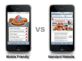
 Mobile Friendly:
Put simply a ‘mobile friendly’ version of your site will show predetermined ‘primary navigation buttons’ on the mobile device.
You get to specify what those ‘buttons’ are but that’s the simplest explanation.
This is great if you have a store front type business, say a café, and you want to simply display primary functions a mobile user may want to use such as a link to your ‘location map’, your ‘food menu’, your ‘contact page’, perhaps your ‘about us’ page, even a direct ‘email you’ button, etc.
When someone views your website on their mobile device you need to remember they’re ‘mobile’ (sounds like a given but needs to be said). They’re ‘on the go’ so they generally need to ‘cut to the chase’ on the info you give them hence using a simple ‘mobile friendly’ button navigation style to direct peeps.
Pros: Less expensive (We can easily convert your WordPress website to a mobile friendly version starting from $550.
Most ‘mobile friendly’ solutions will also give the option so the viewer can choose to revert to standard view or mobile view.
Mobile Responsive:
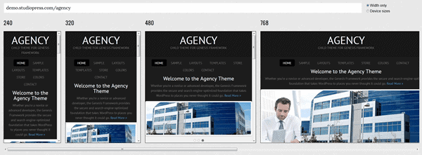
A mobile responsive website automatically changes the layout and/or content to fit the device you’re reading it on.
It’s a beautiful thing.
If you own that café and a potential client is browsing your site from a mobile phone, you certainly want to make it easy to navigate but it would be nice if you were able to keep your graphically gorgeous elements showcasing your business.
Typically there have been four general screen sizes that responsive design has been aimed at: the mobile phone, the tablet, the small desktop (or laptop) and the widescreen desktop monitor.
But if you’ve planned out your site well, using nice graphical ‘doorway’ buttons to direct your visitors along the right web ‘journey’ and you have other nice graphical elements or a slideshow it’d be nice for them to see that too right?
Mobile responsive design takes care of this all ‘on the fly’, and without multiple versions of your site to maintain.
Can you see the benefits of having differing content presented to people in different screen viewing circumstances?
A ‘mobile responsive’ site will ‘stack’ your existing site layout. So now you can still keep your branding, your graphics and perhaps that slideshow of your ‘to die for’ dishes (or any gallery) so regardless of what format it is being served up in you still get to give a good user experience. Has to be Google Brownie points for you huh?
But what makes good mobile responsive design?

Base your design on the online journey you need to take people on, your information architecture so to speak, what doorways do you want them to ‘walk through’. You’re not building a web ‘page’ anymore but rather a ‘network of content’ that can be arranged and displayed to show it off in the best way possible, no matter where and how it is being viewed.
As you can see in the demo shopping cart site above, as the screen gets smaller, the content shifts and changes to the best display for each screen.
Do you need to go mobile friendly or mobile responsive?
In consideration of mobile usage, mobile search and the mobile shopper (won’t that be all of us one day) mobile friendly or mobile responsive websites are quickly becoming a necessity to a complete marketing effort. Whether you go the ‘friendly’ or the ‘responsive’ route depends on many factors.
If your website is older than 3 years old it may well be time for a ‘refresh’ anyway, and upgrading to mobile responsive may not as expensive as you think. More than happy to chat on 08 9439 2820 about what would give you the best ROI!
Wondering if this applies to you yet?
Check your web analytics to see what percentage of your traffic is coming from a mobile device. If it’s getting close to 10% or more, many would say you’re already running late.
And at the rate the times are changing, if you’re not ready yet, make sure you check your stat’s in 3 months from now!
Test Drive Your Site HERE:
In fact, StudioPress have their own mobile responsive website design testing tool.
Test drive your own site but also one test of our new mobile responsive sites so you can SEE a mobile responsive website in action – www.smartershop.com.au
(copy and paste www.smartershop.com.au into the mobile responsive website design testing tool ‘Test your own site… and hit enter’ to see it in action, remember to scroll all the way to the right to see the pc version as well as the mobile version)
Not sure on your mobile device traffic stat’s?
Give us a call NOW and we’ll give you a hand – 08 9439 2820


